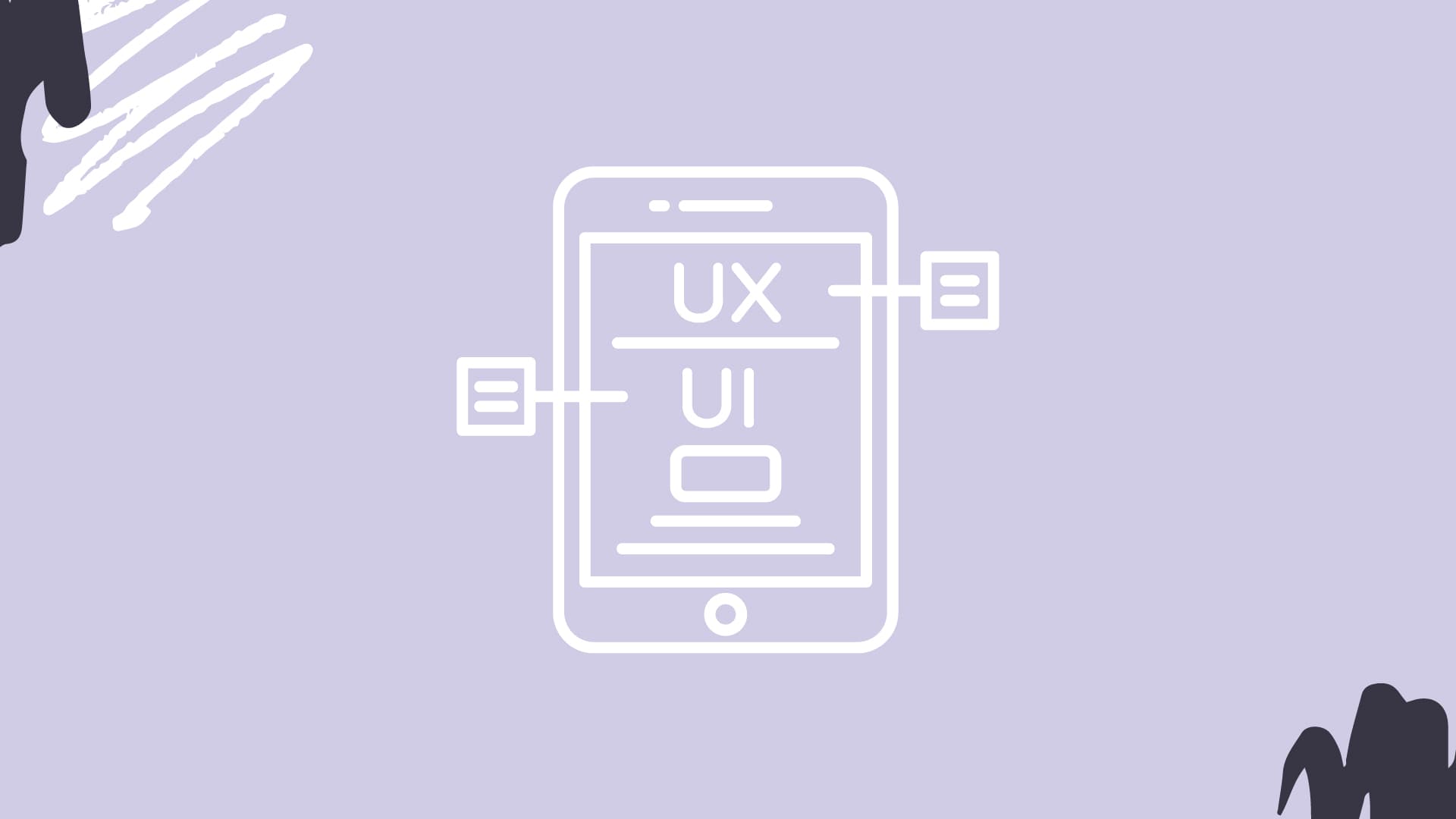
5 UX/UI Trends That Will Revolutionize Your Website
Have you ever been to a site that isn't mobile responsive? Click on a website button that doesn't work or leads to a 404 page? Feel like you're interfacing with a site from the early 2000s?
The struggle is real.
In terms of website design and functionality, we've come a long way. Just travel back in time with the Wayback Machine to get a taste of what websites were like even a decade ago. But there are still sites that feel very dated. Or, maybe they've caught up with the times, but they still didn't get it quite right.
This is the bottom line:
When a returning or new customer interacts with your website, there is nothing more important than the User Experience (UX) and User Interface (UI).
Another way of putting this is the overall form and function of your site. What are the interactions like for the end-user (from navigation to transaction), and how is the overall experience with your brand? Think about any site you have visited...
What draws you in? What are your pain points? Is the site slow to load? Is the navigation confusing? Do you understand what the business does or sells?
You may love the aesthetic, but what does that matter if the purchasing process is a nightmare? Or maybe purchasing is a breeze but the site feels dated, which can leave a bad taste in your mouth...
All of this to say that when looking at any trends, you'll want to consider the end-user, which is what UX and UI are all about. Understand that these trends below are simply that, just trends. Some may be here to stay and others may not be long lasting. You want your site to have that "Wow Factor" but also provide a seamless experience for your customer. So whether you're updating your site or making some changes, here are 5 incredibly sophisticated UX/UI trends that will modernize your website.
- Augmented Reality
- Glassmorphism
- 3D Sculpting
- Micro-Interactions
- Triggered-Scrolling Animation
In the section below, we cover all of these trends in detail. Some you will jive with, others maybe not.
Let's dive into it.
Augmented Reality
Definition: Augmented Reality (AR) is when there is a computer-generated element interacting with the real-world environment.
AR isn't new to 2021, but the applications of AR are expanding and becoming more creative each year. Google and Apple have already introduced their own AR development platforms, ARCore and AEKIt — blending physical and digital worlds.
Here are some examples of AR. Have you ever played Pokemon Go?
We know it's so 2016, but this is a great example of AR. For those of you who didn't give into the "Gotta catch 'em all" craze, this AR application allows you to catch Pokemon in the real world. I caught a Pikachu in the office once (note the timestamp, 2016).
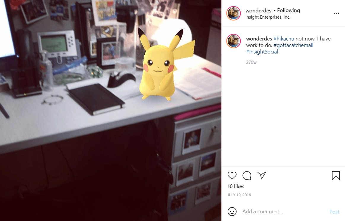
And, Pokemon Go is still kickin’ it. They celebrated 5 years this summer and Pokemon Go Halloween is coming to a downloaded app near you.
Another example is one you've likely seen while shopping online for home decor.
Last year before purchasing an artificial Christmas tree from Target, I was able to see how it looked in my home by placing a digital version in my living room.
IKEA Place has the same function, allowing you to "place" furniture throughout your home. This is a digital "try before you buy" application.
Both Pokemon Go and IKEA Place are an example of real-world related applications, which are digital elements interacting with the surrounding physical world.
There is also object-related and/or geo-tagged AR, which use real-world objects and/or places that have tethered interactions.
A great application of this is being used by museums around the world. Using a smartphone or tablet, visitors are able to interact with an exhibit. This can be anything from holding a device over a painting that brings it to life and provides audio facts about the history, to making something appear (from art to moving animals) where it wasn't before.
UX/UI designers are always pushing themselves to think outside of the box and AR is a great example of this.
Glassmorphism
Definition: Glassmorphism essentially relies on contrast to make the design pop. Light or dark objects are emphasized over a fogged-glass treatment, layered on top of colorful backgrounds.
Think of Glassmorphism as a piece of virtual glass.
This design trend has been picking up steam and is one of my favorites from an aesthetic perspective. It has a very modern and clean look and feel, without feeling boring or overly sterile.
UX Collective does a solid job listing the defining characteristics of Glassmorphism:
- Transparency (frosted-glass effect using a Background Blur)
- Multi-layered approach with objects floating in space
- Vivid colors to highlight the blurred transparency
- A subtle, light border on the translucent objects
Here are a couple of examples that stand out to us:
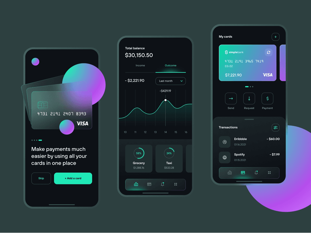
This example is for a wallet app by Dmitry Litvinenko for Fireart Studio. You can see the use of light font (white) and light-colored (mint green) icons, buttons, etc. on top of fogged glass — contrasted against a solid black background.
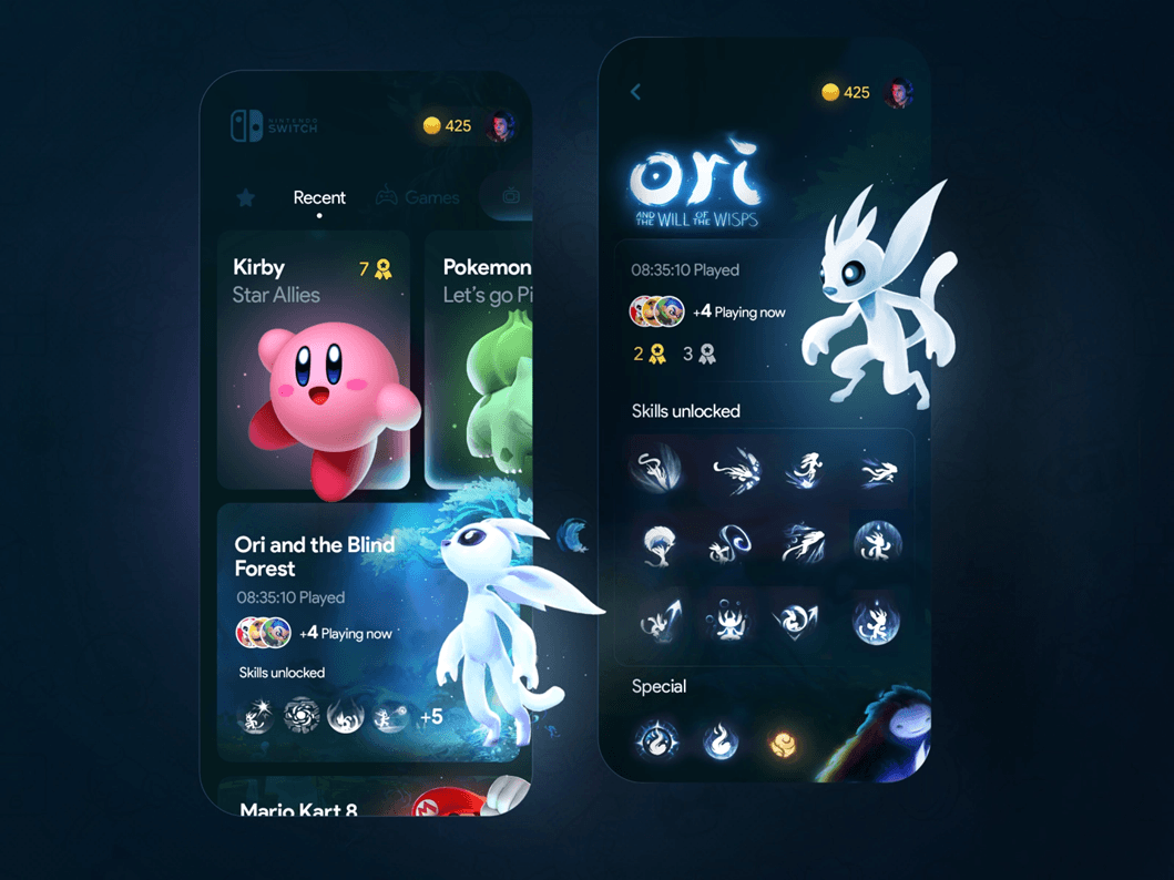
And sticking to the Pokemon theme, here's another example of Glassmorphism, a Nintendo Switch Store app concept by Offriginal. You can see how the fogged glass allows the characters to pop. This multi-layered approach makes these objects appear as if they are floating in space.
Both of these examples have very dark backgrounds, but this is not the case for all Glassmorphism treatments.
You can find a plethora of examples on design portfolio websites like Dribble, which is a great site to get your creative juices flowing.
3D Sculpting
Definition: Digital sculpting, also known as sculpt modeling or 3D Sculpting, is the use of software that offers tools to push, pull, smooth, grab, pinch, or otherwise manipulate a digital object as if it were made of a real-life substance such as clay (Wikipedia on 3D Sculpting).
3D Sculpting is not new, but what makes this a 2021 trend is that devices are now powerful enough to process these complex visuals.
Computing power is only continuing to grow, providing more possibilities for designers. This goes back to the point about loading time, I brought up earlier in the blog. You may be able to create something amazing, but is it going to slow down the overall experience or crash someone's device?
But in 2021, the computing power is strong. What it all comes down to is making sure that the 3D Sculpting you choose to implement is a positive addition to the overall user experience.
What makes 3D effects an appealing design choice for your website is that not many designers are able to create these effects. In other words, the market is not oversaturated with this design choice. There are a lot of tools popping up that allow 2D designers to experiment with 3D elements, but those with this skillset now are ahead of the game.
Adobe XD introduced a new feature called 3D Transforms, which allows "an object to be manipulated within a three-dimensional space, creating tilts and rotations as well as changing the depth of an object on the canvas."
Vectary is another tool designers can use, which "provides an intersection between 3D and 2D creative tools."
And believe it or not, I found another Pokemon example...
This video takes you through a workflow of how to use another tool called Nomad Sculpt, using an iPad. You can watch as 2D Squirtle becomes 3D. And maybe you can even catch him in the real world.
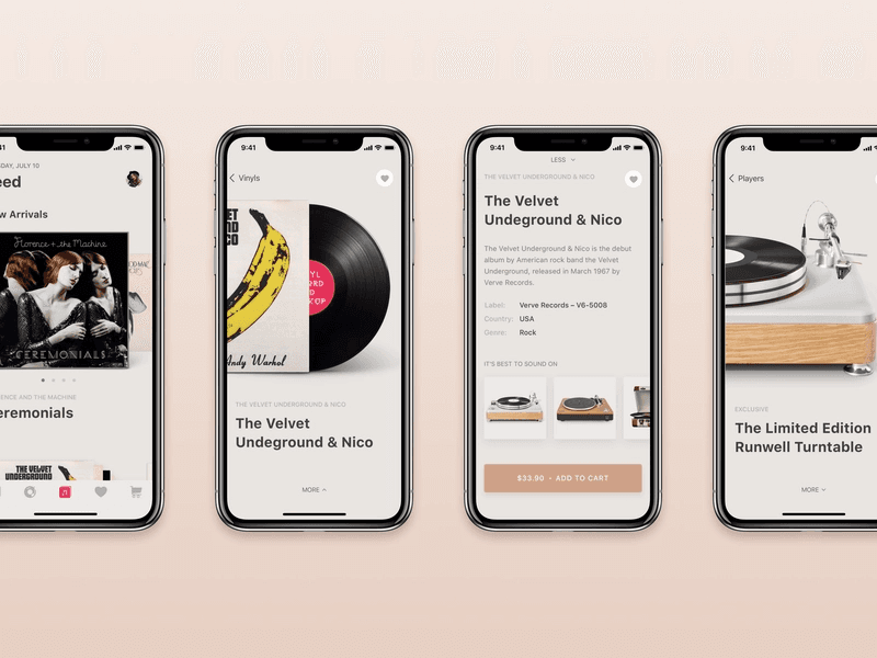
Here is a crisp example of an e-commerce app by Tubik that uses 3D Modeling to highlight records and record players. As the end-user, you can see how this UX/UI application of 3D Modeling brings the retail experience to life, making something digital more tangible.
3D Modeling is a creative way you can draw your user in and keep them engaged. What once was something only seen in video games and on the big screen, has made its way into a variety of businesses and industries... for those who dare to create such an experience.
Micro-Interactions
Definition: A Micro-Interaction is a simple animation or small change in the interface when a user interacts with something on the site/app (think of your mouse hovering over an icon that triggers a change).
From a design perspective, the purpose of a Micro-Interaction is to be engaging and create a moment where the user thinks, "Oh, that was cool."
From a functionality perspective, it's meant to help communicate information to the user (think of a loading bar icon, letting you know the percent of your download's completion).
You've likely already experienced a lot of Micro-Interactions. Some of them may not stand out, with their simple approach. But there are quite a few examples that are simple, yet incredibly impactful visually.
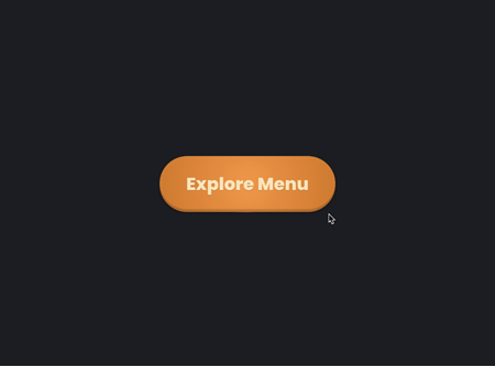
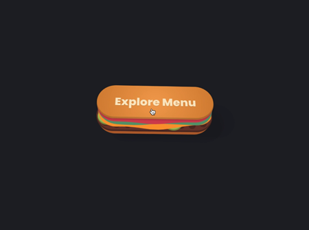
This 3D Button by Aaron Iker turns a simple "Explore Menu" button into a moving burger when you hover over it. It's not too flashy, yet brings a lot of fun into a simple user action. And it definitely gets you thinking about burgers. And, this is a simple example of 3D Sculpting.
While a lot of Micro-Interactions are button-related, they also get used to provide status updates. This example by Sub1 uses Micro-Interactions across an entire dashboard. Click here to see all the simple animations that have been included: scrolling numbers, moving waves, and bars corresponding to data, an animated soundwave.
And bonus, as you’ve probably noticed, this is also a great example of Glassmorphism!
Overall, Micro-Interactions are a great way for users to engage with your website, and they make it easier for those users to interact by providing direction, status updates, and navigation. Plus, let's be honest, they're a delightful surprise in what could be a static experience.
Triggered-Scrolling Animation
Definition: The name is pretty self-explanatory, but Triggered-Scrolling Animation is when text, graphics, photos, videos... are triggered by you scrolling down a page.
We use this on our site, as well as our client sites. Take a look at our client's site Daybreak, to experience both Triggered-Scrolling Animation and Micro-Interactions.
Triggered-Scrolling Animation is a very effective way to engage your audience from the second they land on your page, by catching their attention from the start.
A report by the Nielson Norman Group states visitors decide to stay or leave a website within 10 to 20 seconds of landing on the page.
This means UX/UI is very, very important.
But if you don't keep your user on the page then they won't get to experience all the amazing features, capabilities, and work you've put into it. That is why incorporating design elements that grab their attention from the start can make a huge difference.
There are different types of Scroll-Triggered Animation. Parallax Scroll Animation is where you move the foreground at a faster speed than the background. Another type is where you can have individual elements that animate when they come into view on the screen. And then there is Scroll-Triggered Video, where a video plays once you arrive at where it lives on the site.
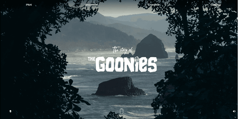
If you're a child of the 80s, or a child of a child of the 80s, then you've likely seen The Goonies, and this site is one of my favorite examples of Triggered-Scrolling Animation.
It has Parallax Scroll from the start. It has elements (coins) that animate when they come into view. And it also has some Micro-Interactions throughout the site.
This website dedicated to the work and life of Stanley Kubrick also incorporates all the different types outlined above, but serves as an example of Scroll-Triggered Video, further down the page.Triggered Scrolling Animation is a great tool for designers because it allows them to control what loads on the page first. You can use this to highlight key areas you want your audience to view or interact with from the onset of their experience.
How do You Choose Which UX/UI trend to Use?
When presented with a list of trends and thinking about how you can incorporate them into your site or app, it can be both exciting and overwhelming. In the end, you want to excite, but not overwhelm, your end user. No matter what type of trend you choose, there are always important things to consider. You want to ask yourself…
- Am I telling the right story through these animations?
- Does this help my end user or hinder them?
- Is the load time worth the outcome?
- Does this help the end user understand my product or service?
- Will the trend I've chosen help my user navigate through the buyer experience?
Basically, is the UX/UI juice worth the design squeeze? Just because you think it's cool, doesn’t mean your end-user will.
It reminds me of all those cooking shows I watched during quarantine where a chef would say "This is the way I like it" as an explanation for their ingredient choice, and Gordon Ramsey would say (or more likely yell), "Well you're not cooking for yourself!"
Once you've answered these questions and feel like there are more positives to check than negatives, give it a go. And as always, A/B testing is a great way to understand how your user is interacting with your site and/or app. But that's a blog for another day.
For now, make choices that are right for your end-user, because in the end, they will be right for your business. But our advice is... don't be afraid to get creative and try something new.
If you just don't know where to start or what to choose, we can help! Overlap offers Design Services and Web + App Development. We understand how powerful UX/UI can be and love seeing how different designs can bring a business to life for the customer — transforming both your customer's journey and the journey for your business.